timeline
Jan 2025 - Oct 2025
project type
Design Systems

project overview
Our team works on Meta’s most widely used design system, powering thousands of internal products horizontally. Unlike traditional projects with fixed scopes, this system is an ongoing effort that evolves alongside the products it supports. Our goal was to ensure its continuous evolution by expanding components and patterns, maintaining quality standards, supporting product needs, and addressing emerging needs as they arose.
contribution summary
Drove and launched several new components and key features
Design lead for core mobile experiences
Icon and illustration migration support across the system
On-call support for urgent product team needs and questions
problem space
Over time, as internal products surfaced new needs, we found several opportunities to evolve the system with more reusable and scalable solutions. Whether it came from new requests, fixing system issues, or opportunities to improve efficiency, we focused on the most common and high-impact priorities.
approach
Audited custom components with similar functionalities and partnered with several teams to identify opportunities for shared solutions
Reviewed feedback, support requests, and recurring pain points from product teams to better understand unmet needs
Analyzed backlog items to uncover any previously identified opportunities

the grid view
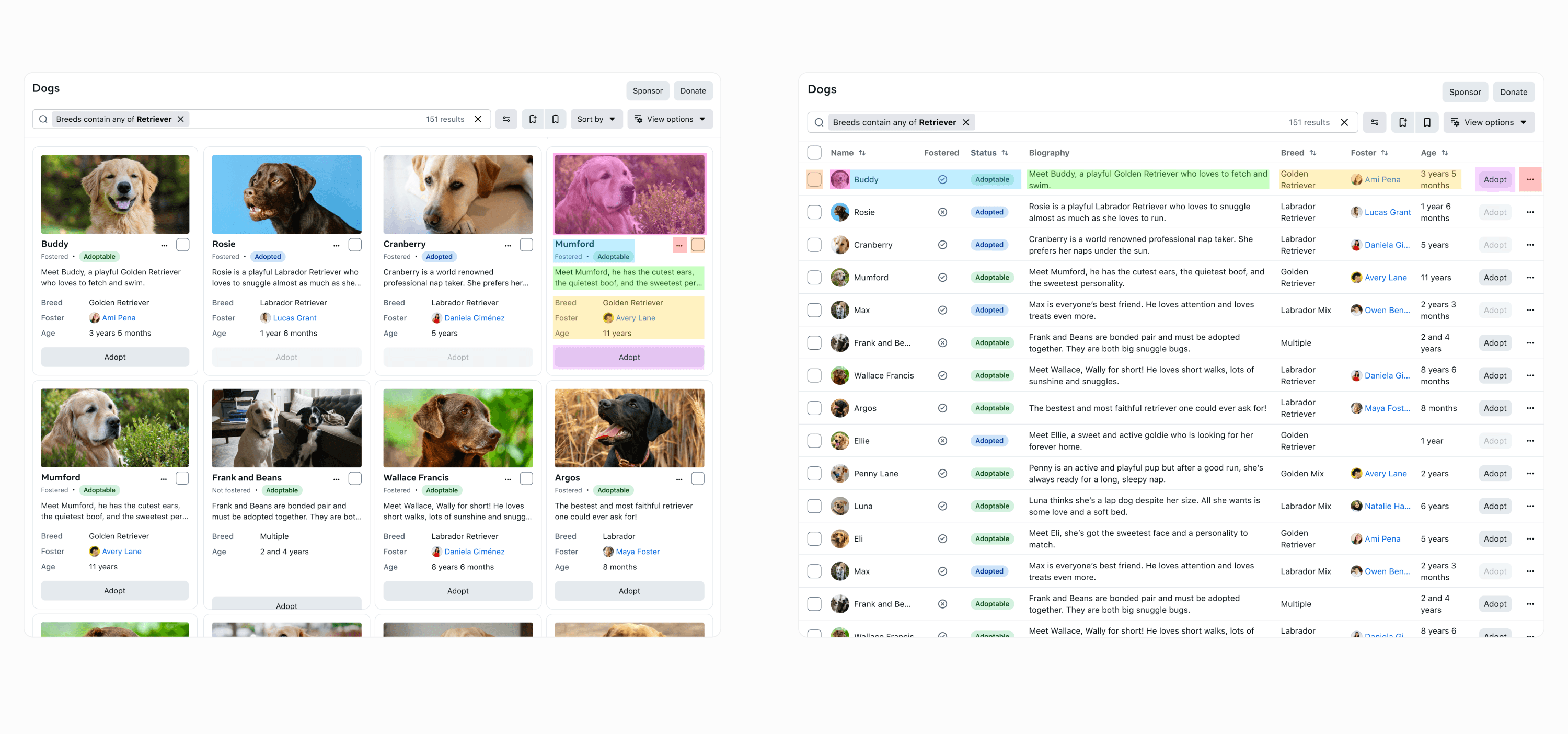
Working on the grid view was a fairly complex effort, since it involved a full page experience with many possible flows and interactions to account for. As a jumping off point, we broke it down and started with a card component used for displaying scannable information to help users take further action. An example of where you might find a card like this would be on marketplace platforms.
Before diving into the designs, we led alignment discussions with several product owners and discussed consolidation efforts to help minimize any redundant work. With a full understanding of requirements, we designed the card component and then conducted a full criteria assessment to validate feasibility. The card had gained hundreds of usages within a few months of its launch.
Once the card component was completed, a big portion of the grid view was defined and we focused on the remaining interactions. Because we already had an existing and successful table page, we explored combining it with this new grid view. The goal was to be able to seamlessly switch from displays in a table to displays in cards and vice versa. The outcome was an umbrella page which could contain a grid view, table view, and any other future views.

the view options
View options is a feature that supports page filtering and customizations. We found that over the years, product owners were custom building their own version of this feature to fit their specific workflows. After many iterations and alignments with partners and stakeholders, we worked to provide one modular solution with a wide range of customization options to fit as many use cases as possible. This new feature had gained hundreds of usages within a few months of its launch.
Prior to the grid view work, we had designed the view options feature to function within table pages. When the grid view was finished, we evolved it to be able to show specific customizations for both table views and grid views.


the mobile experience
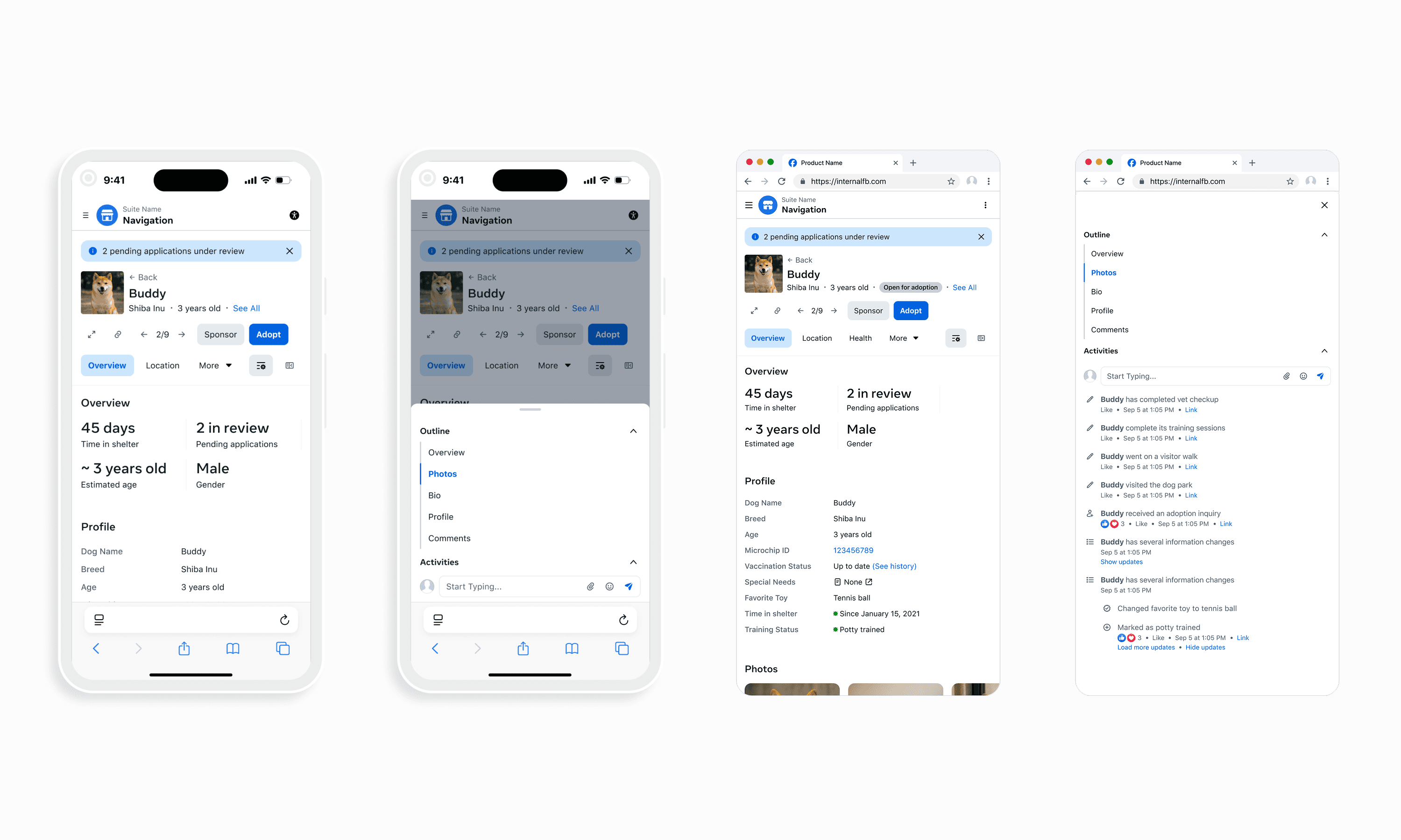
Our system had historically catered towards desktop sizing, so we set out to translate our components and patterns to both small desktop and mobile sizes. Our goal was to help improve usability and ensure users could complete tasks effectively regardless of screen size. The impact of these improvements reached thousands of usages across these components and patterns. Furthermore, we also established and strengthened cross-team partnerships by supporting quick wins and providing mobile best practices for their specific products.

learnings
Don't let perfect be the enemy of good. While working on some of these new features, there wasn't always a straight forward direction. In fact, most of the time one product owner would have a completely different set of priorities than the other. But because this is a design system, I had to take everyones priorities into consideration. There were certainly moments where my designs were far too simple and then they got over-complicated, but with a lot of exploration, conversation, and prioritization, we came to 'good' conclusion that suited majority use cases and everyone was happy with.